
Simple tricks I use to make web apps mobile friendly
Many business applications require complex interfaces with vast amounts of data and features. It is very important to understand where your users are using your application and what kind of actions are being performed on the computer or on the mobile phone. I myself always avoid to use complex applications on my phone. I prefer the desktop screen that is bigger and my computer keyboard who is easier to write than the mobile keyboard. So anytime I have to write large amounts of text or visualise and understand high volumes of data, I will always go to my computer instead of my phone.
But there are also cases where my phone is the best option. Sometimes I need to perform quick actions with just a few clicks or read messages as soon as they arrive. If I am on the bus on my way to the center of the city and I receive a message from one of my clients asking when was the last time his application was updated, I’m not gonna open my notebook on the bus, login to Github, find the right project and check the information. I can do this quickly using the mobile app with just a few touches. The information is simple, is just a date.
So my first trick is:
Understand what features are worth making mobile friendly
I know there is a temptation of making your whole app mobile friendly. And if you ask your users if they want to be able to do everything they do on the desktop on their phone, sure they will answer yes. But the reality is, specially in B2B applications that usually are more complex and data intensive than B2C applications, it can be a huge mistake making everything mobile-friendly. Not only you will increase the complexity of development and maintenance of your application, you will also make it harder to improve your user experience and design, since you will have the double of the work thinking of two different user experiences ( mobile and desktop ) for each feature, interface and action.
My rule of thumb for this cases are, if the user has a screen that he needs to fill a lot of information with written text, dynamic tables, have elements that can occupy a space that the visualisation from a mobile phone would require a lot of scrolling and zooming, I would highly suggest to leave it out of the mobile experience.
Stacking vertically and horizontally
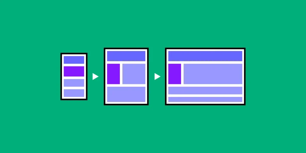
Image taken from here.
The rule is simple. Think of your interface as different blocks that contain information or action elements. Each block must contain elements that have something in common. For example, if you have a list of contacts, each block will contain information relative to contact such as name, address, phone, maybe a pic and a button to call or edit the contact. In mobile screens you have a small horizontal space but an infinite vertical space because of the scroll.
So in a mobile contact application, the block of contacts will be stacked on vertical, one above the other, allowing the user to view the full information in each block and scrolling vertically.
In the desktop you have more space horizontally than vertically, so instead of having just one contact per row, you can have maybe three or four. You will still have a vertical list with scrolling ( depending on the number of your contacts ) but you don’t need to constrain the horizontal space anymore.
Navigation
One pattern of navigation very common on B2B desktop applications is sidebar menu. Below you can see an application that I helped on the development. It’s a B2B SaaS that contain a navigation panel with the options Dashboard, Notifications, Information, Messages, People, Ask an expert and Settings.
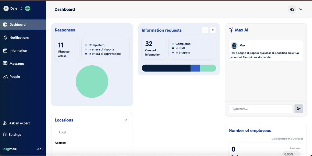
When the user navigates in one of these options, the panel on the right changes. It works fine on the desktop which has a lot of horizontal space. But think about the mobile experience. How can we make it work? This is a real problem we have faced when developing this application.
You can also see that the dashboard is quite complex. It has a lot of information, with graphics, dynamic data, maps and you could also change the widgets and move them to change the order. We realised that the mobile experience for the dashboard would be quite complex and the visualisation would be impacted because of the size of a mobile screen. This is why we decided to not include the dashboard on the mobile experience.
The most common pattern for this kind of navigation on mobile is the bottom bar. You have seen it a lot but maybe didn’t realised it yet. On the bottom part of the screen there is a section with buttons that allow you to navigate from one screen to another:
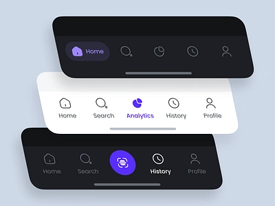
Image taken from dribble.
So our first idea was to add all the other navigation options to the bottom bar. As you can see on the examples on the image above, usually there are maximum 5 buttons on the bottom bar. This is because every time you add a new button you have to decrease the size of the others to fit the new button on the horizontal space.
You can argue that you can also add the horizontal scroll on the bottom bar to fit as many as you want but this would impact you user experience because users expect a consistent navigation experience and with the horizontal scroll the other buttons will be hidden from the user and he might not even be aware that they exist at all.
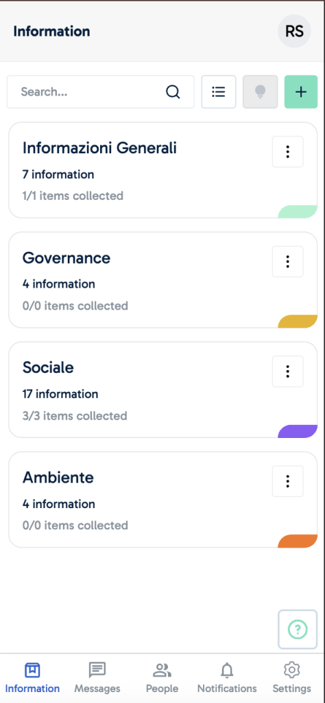
So we decided we had to remove one of the options from the bottom bar to make it fit 5 buttons. The choice we made was the Ask an expert section. The reason we decided is that this option don’t actually navigate to a screen, but opens a pop-up in which the user can request the help of someone from the team.
We couldn’t also just remove it from the mobile app as we did with the Dashboard since asking for help was important also on the mobile experience. The final solution we found was to add the Ask an expert feature as a square floating button above the bottom bar which made the mobile interface looks like this:
I understand we still have room for improvement on both mobile and desktop screens. But based on the time constraints we had for the development and release of these features, we were able to provide our users with an experience that allowed them to use the application in both mobile and desktop in a intuitive way.
Thanks for reading!
If you reached the end of this post, I would like to thank you for reading. I hope sharing my experiences with B2B apps can help other professionals avoid some mistakes I made myself and create better apps. If you want to keep in touch feel free to add me on LinkedIn.


Leave a Reply